Smiley's Electronics: February Sales Report
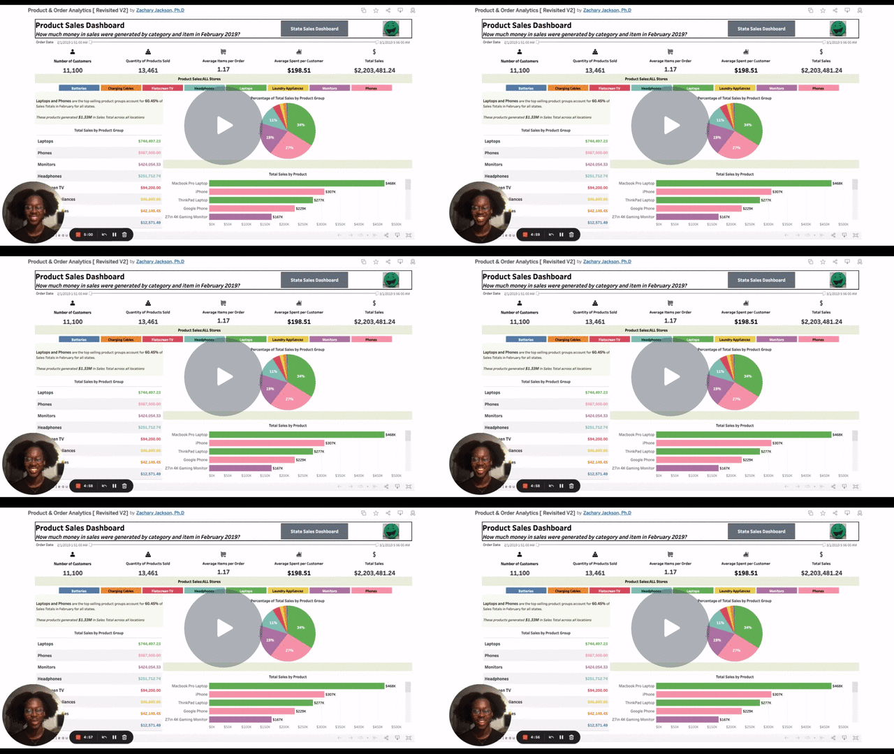
I built an interactive, descriptive dashboard in Tableau that reports key sales metrics and provides additional store performance insights per ad-hoc request from the new National Sales Manager.
Project Summary
Here’s a video of me walking through the entire project in less than 5 minutes:
Project Links
Business Problem & Key Questions
Smiley’s is a thriving electronics store that has multiple stores nationwide. It has remained profitable, despite other electronic stores (i.e., Fry’s and Circuit City) going out of business. The new National Sales Manager wants to ensure Smiley’s continues to do well. As the data analyst on the sales team, I’ve been tasked with creating a report that shows the February sales.
Smiley’s sales team has 5 standard metrics in each report:
Number of Customers
Quantity of Products Sold
Average Items per Customer
Average Spent per Customer
Total Sales
In addition to those standard metrics, she is interested in the following key questions:
What products make up the majority of national sales?
Which states/cities performed the highest based on the metrics?
Which states/cities performed the worst?
Data Preparation
To prepare my data, I first had to connect the data to Tableau.
I downloaded the two CSV files I needed:
Sales_February_2019
customers2
Then I dragged and dropped the tables into the Tableau Data Model.
I create a relationship between the two tables by specifying the relationship so Tableau knows how they're related.
After renaming the necessary columns, I clicked over to the first sheet and started visualizing the data.
Approach
For the 5 standard metrics, I used the following approach:
COUNTDfor the number of customersSUMfor the quantity of products soldCreated a calculated field for $ Spent per Customer
= SUM([Quantity Ordered]) / COUNTD([OrderID])
Created a calculated field for $ Spent per Customer
= ([Total Sales]) / COUNTD([OrdersID])
Created a calculated field for Total Sales
Total Sales
= SUM(([Price Each]) * [Quantity Ordered])
Here’s the approach I used to answer see what products generated the best sales and how much of each was sold:
Created an Order Date Filter to allow users to explore granularity.
Created “Product Groups” that combine related members in a field
For example, MacBook Pro Laptop and ThinkPad Laptop were grouped as Laptops.
After grouping products, I created a table showing the total sales of each group using
SUMof Total Sales.I included a pie chart with a tooltip that shows the percentage of February’s total sales that each group generated.
I created a bar chart that lists each product for comparison.
Each product’s bar is color-coded to show what group it is related to.
Here’s the approach I used to see which states and cities performed best in February:
Created a separate dashboard displaying a higher-level view
* Dashboard can also be filtered by clicking on the state of interest on the heat map*
Within this dashboard, there are two key visualizations:
a geographic heat map showing the total sales by State
a subheader with navigation buttons for the 5 key metrics to allow exploration by city
a table that displays the metrics of interest by city
* These navigation buttons will allow the new National Sales Manager to have options based on the standard metrics on how she wants to judge the performance of the stores*
Given this was the first pass at what she wanted, I would use this dashboard as a launching pad and see if there were any other specific metrics she would like included or to be the focus of the dashboard.
Results & Key Takeaways
Product Performance
Laptops and Phones are the best-selling products. The MacBook Pro, Think Pad Laptop, iPhone, and Google Phone are the top sales-generating products.
Store Performance
As the analyst on this project, I am going to recommend the average spent per customer (the table below) because this measure accounts for population differences, unlike the number of products sold or $ in sales.
New York, New York was the best-performing store based on the average spent per customer at $206.49.
The Portland store in Maine performed the worst by this metric, only averaging $185.38 per customer.


